PRODUCT DESIGN: Concept to Release
Netflix on the Echo Show
As the Echo Show began to take on a life of it’s own, there were several key trends in customer requests as it pertained to video content. The first, users wanted Youtube on the device. The device was perfect for short form content and light weight viewing experiences. The second, they wanted Netflix.
Partner Feedback
Desire to Have More Control of Their Multimodal Experiences
Post launch, discussions with the Alexa’s 3p partners was consistent. They found value in the new opportunities that came with the Echo Show and with VUI in general. The technology was fresh and while customer engagement wasn’t anywhere close to our typical remote/television behavior, it did open new doors and while not immediatly moving the needle substantially. The interactions and behavioral trends were different and unique to the device and customers were engaging with their content in different ways. All exciting things.
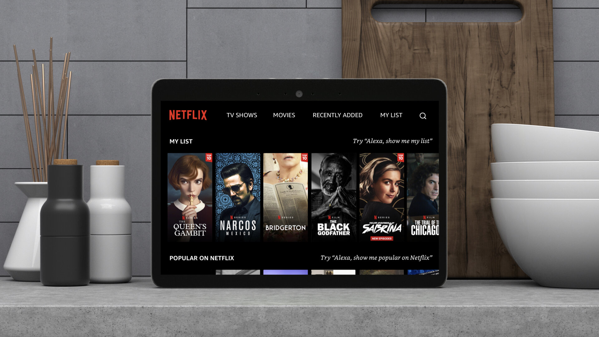
Across the board, however, content providers (ie. Netflix / Hulu / NBC / Prime Video) wanted to have more control of their experiences. What does “control” mean. Well, it meant several things. For one, they wanted their experiences to feel more like their other products (phone and tablet apps / web sites / tv apps). The multimodal/Echo Show experience was jarring from the moment a user engaged with providers content. Alexa’s device tenets steered the design towards global patterns and consistency, with that came templates that often seemed foreign to what users were accustomed to. Customers engage with video content on a daily basis and have built a familiarity with not only the product’s taxonomy and hierarchy, but their is also a comfort that can be associated with brand aesthetic that was missing from the Echo Show’s initial templates.
Netflix had a strong desire to carry their design into the Echo Show, as reflected in the previous screens. I , for one, see the value in bringing more parity and brand personality into the products and imagine that this will continue to be an emerging requirement for new and existing Alexa partners. There will need to be trade offs and compromises from both parties to make this work. After all, nobody knows Netflix better than Netflix (the same goes for Hulu and Prime Video)… and equally important, Alexa has a strong grasp on how to best leverage voice as an interaction mechanism.
Key Scenario
Concept: Resuming Content
People are multitaskers and frequently interrupted while watching TV shows and movies. Creating a more seamless resume experience was part of the initial design concept.

In this scenario: The user sits down to watch Netflix on her living room Fire TV.

In this scenario: She pauses the show and decides to move into the other room to start prepping dinner for the evening.

Alexa recognizes the woman as she enters the room, the ambient home screen lights up and displays the content that she was previously watching with a prompt to RESUME.

She says “Alexa resume Netflix.” Alexa responds and takes her right back into her show where she left off. Now she’s able to follow along with her show while she prepares the family meal.
Key Scenario
Concept: Browse
Prompting Alexa for video content is different than music. With music, you can passively listen to your favorite songs, while video content requires a different type of attention and landing someone on an previously watched episode needs to be easily remedied.
There are several tricky interactions that come with VUI that may seem trivial at first. As the designs evolved and became more content rich, so did the interaction patterns. For example, with remote and touch UI, bi-directional scrolling (lists of lists) is pretty much a standard and basic pattern.
For example “Alexa, show more”. Sounds simple enough, right? But in our informal studies, the user expectations and findings were very polarized, almost to a perfect 50/50 split. Should “Alexa, show more” scroll up or scroll right? Now what happens when two carousels are in focus? Do they both scroll?
The concept below illustrates my proposed solution, which constrains the view to single carousel or module in view at a time.
SCENARIO: Dinner Prep

In this scenario:
Our user is in the kitchen following along with a Cook Along recipe on the Echo Show.

In this scenario:
She’s approaching a stopping point in the recipe and ready to put the dish into the oven.

She puts the food into the oven and sets the timer for 25 minutes.

She loves cooking shows and decides to put one on while she waits for the food to bake. She says “Alexa, show me some cooking shows on Netflix” and takes her to a search result page with the top shows. She says, “Alexa, play Chef’s Table.”

Alexa takes her into the episode of Chef’s Table that she was previously watching.

She’s decides to that she would rather watch a different episode and taps the screen to bring up her browsing options and taps the “EPISODES” button.
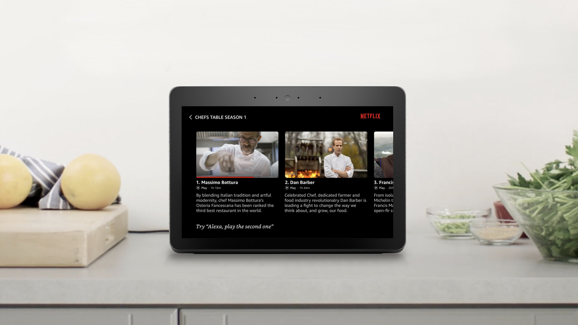
Alexa takes her to a horizontal list of that season’s episodes. She finds the one she likes and watches that while getting the rest of the meal ready for her family
Design
Concept Story Telling
While the Netflix Echo Show release is slightly different than the prior concepts, they did adopt some bits and pieces and took the opportunity to imbue the aspects of their product that they considered to be essential for their multimodal debut.
That said, conveying Alexa’s UX vision via narrative story telling and intimate real life scenarios helped to bring the concept to life and facilitate discussions between the teams. Too often, UX presentations fail to paint a clear picture of the design intent and end up in rigid task flow diagrams and screen flows. While those have substantial value, we found success in coupling our design concepts with easily relatable day-to-day commonplace customer vignettes.